Scale the Y-Axis
Sometimes the data that is used in charts does not span a wide range of values. For example, a simple bar display shows inventory levels for three products at 14,000, 14,150, and 13,900. The labels and grid lines on the Y-axis are at intervals of 500, making the individual values for each product difficult to distinguish. You can scale the axis to focus on the 14,000 range. This has the effect of visually separating the tops of each bar in the display.
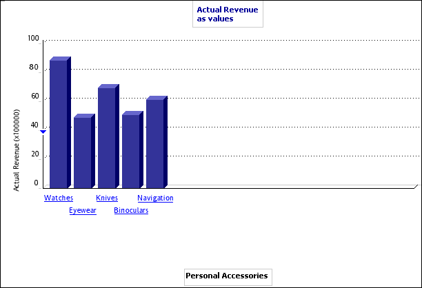
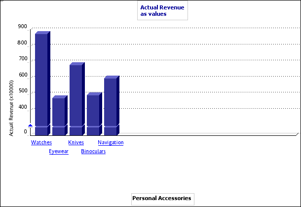
For example, your report for the revenues of Personal Accessories contains the following display.
To make the data more meaningful, you can scale the y-axis to give you the following:
You can scale the y-axis for the following display types:
- simple bar
- clustered bar
- stacked bar
- multiline
- three-dimensional bar
- correlation
- scatter
This feature is unavailable if the range of all values is greater than the minimum value.
Steps
- Click the arrow to the right of the Chart button
 on the PowerPlay Web toolbar, and then click a chart type.
- Click the arrow to the right of the Chart button and then click Chart Options.
- Click the Scale tab and select the options that you want:
- To set the maximum or minimum scale value, select the Use manual axis scale check box, and enter a value in the appropriate box.
- To turn grid lines on or off, select the Show the gridlines check box.
Note: for a 3D bar display, select the gridline boxes for the appropriate facings.
- To reverse the axis so that the largest number is at the bottom, select the Reverse Axis check box.
- To specify the number of ticks on the axis, select the Number of Ticks check box and enter a value in the box.
- To specify the location of the axis, under Axis Placement, click either Left, Right, or Left and Right.
Note: the last three options are not available for 3D bar displays.
- Click Apply and click OK.