Choose a Display
A display is a visual representation of the report data. You can change displays to
- show information from different perspectives
- find a trend
- compare variables, show variance, and track performance
- compare multiple measures
For example, you can change a crosstab display to a pie display to view the relationship of individual components of your data to the entire data set.
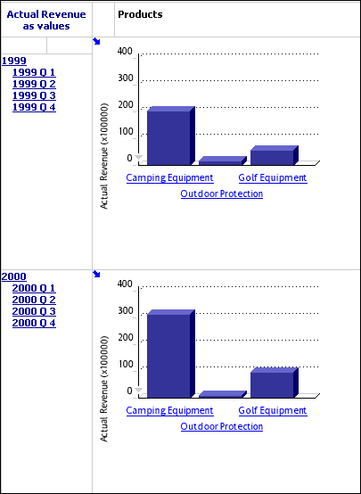
When you view nested categories in graphic display types, each lowest-level intersection is shown in a separate display. To isolate the display for a nested category, click the link for the nested category.
To view summary information for the display, click the Zoom In button  .
.
If there are no nested categories, only one display is shown.
You can use any one of the following displays to present your report. For information about viewing charts and tables together, see View a Chart and Table Together.
Tips
- If some of the chart displays show values that are very close, click the Scale Axis button
 on the y-axis to regenerate the axis so that the close values are more easily distinguished.
- Choose how you want to save the current view:
- On the PowerPlay Web toolbar, click the Save As button
 to publish your report to the portal
  .
.
- Click the File Options button
 , and then click Prepare Bookmark to save your view as a bookmark .
- To return to the initial view of your data, which includes resetting all dimensions to the top level, click the Display Options button
 on the PowerPlay Web toolbar and then click Reset. If you prepared a bookmark, however, you do not return to the initial view.
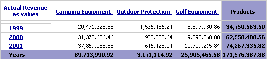
Crosstab Display
The standard crosstab display is the default display type, and it shows data in tabular format. The first two dimensions of the cube represent the rows and columns respectively.
If you nest categories, the nested categories appear in rows below or columns to the right of the top level dimensions.
You can modify the default display settings for a standard crosstab to highlight specific information or to enhance the report presentation. For example, you can customize text, font and cell color properties to
- distinguish calculated values
- emphasize row and column headers
- highlight summary data
If you change display type, the customized crosstab options are not applied to the new display. For example, if you switch from standard crosstab to an indented crosstab, customized settings are not applied to the indented crosstab display. However, the customized settings are maintained in the original crosstab.
Step to Select the Standard Crosstab Display
- On the PowerPlay Web toolbar, click the arrow to the right of the Crosstab button
 , and then click Crosstab.
Steps to Modify the Standard Crosstab Display
- On the PowerPlay Web toolbar, click the arrow to the right of the Crosstab button, and then click Crosstab Options.
- Select an Object Type and Crosstab Position to specify the crosstab element you want to format, and then select Custom Format.
- Change the text, font, and cell color settings.
- Click Apply, and then click OK.
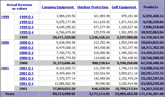
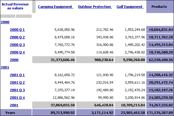
Indented Crosstab Display
Use indented crosstabs so that the levels of nested categories are indented and the relationships between the categories are more easily identified. This display also presents a more compact format than a crosstab, making it better for printing.
You can modify the default display settings for an indented crosstab display to highlight specific information or to enhance the report presentation. For example, you can customize text, font and cell color properties to
- distinguish calculated values
- emphasize row and column headers
- highlight summary data
If you change display type, the customized crosstab options are not applied to the new display. For example, if you switch from standard crosstab to an indented crosstab, customized settings are not applied to the indented crosstab display. However, the customized settings are maintained in the original crosstab.
Step to Select the Indented Crosstab Display
- Click the arrow to the right of the Crosstab button on the PowerPlay Web toolbar, and then click Indented Crosstab.
Steps to Modify the Indented Crosstab Display
- On the PowerPlay Web toolbar, click the arrow to the right of the Crosstab button, and then click Crosstab Options.
- Select an Object Type and Crosstab Position to specify the crosstab element you want to format, and then select Custom Format.
- Change the text, font, and cell color settings.
- Click Apply, and then click OK.
Pie Display
The pie display charts the summary row of each column to show its proportional contribution to the whole. Any negative numbers are treated as absolute values; for example, the values -50 and 50 are plotted as 50. This type of display is useful for situations where there are not too many items.
Note: Categories whose values are less than 10% of the total display are grouped in a slice labeled Other. The Other slice also contains any categories with 80/20 suppression, whose value is less than 20% of the total display.
For more information about 80/20 suppression, see Suppress Values.
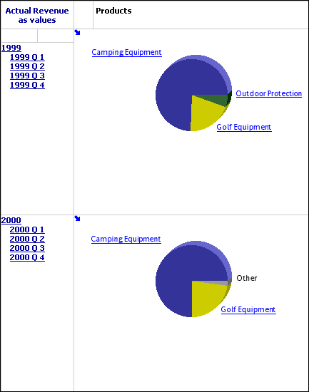
If the display does not have nested categories, a legend is shown which identifies the column and data value associated with each colored section of the pie.
Step to Select the Pie Display
- Click the arrow to the right of the Chart button
 on the PowerPlay Web toolbar, and then click Pie.
Steps to Modify the Pie Display
- Click the arrow to the right of the Chart button on the PowerPlay Web toolbar, and then click Chart Options.
- Click the General tab, and select the options that you want:
- To resize the chart to a percentage of the screen, select the Percentage of Screen check box and, in the Height or Width box, type a number between 10 and 500.
- To choose how values appear, click the Show values check box, and select either On slice or Outside slice.
- To choose how labels appear, click the Show labels check box, and select either On slice or Outside of slice.
- To show lines from each label to the relevant pie slice, click the Include header lines check box.
- To alter the appearance of the pie, use the Depth, Hole Size, Tilt, and Rotation, and Explode settings.
- To specify the legend type, click either Use HTML Legend, or Use Embedded Legend, and select where the legend appears.
- Click the Statistical tab to format statistical lines.
- Click the Palette tab to modify the pattern or color of slices.
Note: You cannot modify the pattern or color of the slice labeled Other.
- Click the Background tab to apply a color, pattern or gradient to the background of the display.
- Click the Labels tab to specify titles.
- Click Apply and click OK.
Simple Bar Display
The simple bar display charts the summary row of each column to show absolute contribution. Use to show change over a specific time period, contrast two or more variables, and reveal trends in a clear format. This type of display is useful for discrete data.
Step to Select the Simple Bar Display
- Click the arrow to the right of the Chart button on the PowerPlay Web toolbar, and then click Simple Bar.
Steps to Modify the Simple Bar Display
- Click the arrow to the right of the Chart button on the PowerPlay Web toolbar, and then click Chart Options.
- Click the General tab, and select the options that you want:
- To resize the chart to a percentage of the screen, select the Percentage of Screen check box and, in the Height or Width box, type a number between 10 and 500.
- To choose how values appear, click the Show Values box, and select either On bars or Above bars.
- To specify the shape of the riser, click the Riser Shape list, and choose either rectangle, beveled, or reverse beveled.
Note: this is not available when you apply depth to the display.
- To specify the size of the bars as a percentage of the available size, use the Bar Size sliding bar, or specify a value in the field.
Note: When the bar size is set to 100%, the bars touch each other.
- To add depth, click the Use Depth check box, and adjust the Depth, and Angle settings.
- To display bars horizontally, click the Horizontal Chart check box.
- Click the Scale tab to scale the Y-axis, show grid lines, or control the number of ticks on the axis. For more information, see Scale the Y-Axis.
- Click the Statistical tab to format statistical lines. For more information, see Scale the Y-Axis.
- Click the Palette tab to modify the pattern or color of bars. For more information, see Change the Patterns and Colors in a Display.
- Click the Background tab to apply a color, pattern or gradient to the background of the display. For more information, see Apply a Background Color.
- Click the Labels tab to specify titles. For more information, see Format Labels.
- Click Apply, and then click OK.
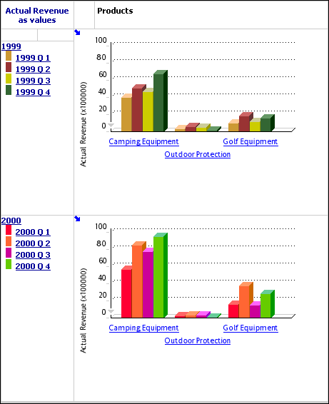
Clustered Bar Display
The clustered bar display plots the cell values of a crosstab in groups so that you can easily compare related information, summaries, and categories. One bar group is created for each column. Each bar in a group represents the row value.
If the display does not have nested categories, a legend identifies the row or column represented by each color.
Step to Select the Clustered Bar Display
- Click the arrow to the right of the Chart button on the PowerPlay Web toolbar, and then click Clustered Bar.
Steps to Modify the Clustered Bar Display
- Click the arrow to the right of the Chart button on the PowerPlay Web toolbar, and then click Chart Options.
- Click the General tab, and select the options that you want:
- To resize the chart to a percentage of the screen, select the Percentage of Screen check box and, in the Height or Width box, type a number between 10 and 500.
- To choose how values appear, click the Show Values box, and select either On bars or Above bars.
- To specify the shape of the riser, click the Riser Shape drop-down list, and choose either rectangle, beveled, or reverse beveled.
Note: this is not available when you apply depth to the display.
- To specify the size of the bars as a percentage of the available size, use the Bar Size sliding bar, or specify a value in the field.
Note: When the bar size is set to 100%, the bars touch each other.
- To set the size of the cluster as a percentage of the available size, use the Cluster Size setting.
- To add depth, click the Use Depth check box, and adjust the Depth and Angle settings.
- To display bars horizontally, click the Horizontal Chart check box.
- Click the Scale tab to scale the y-axis, show grid lines, or control the number of ticks on the axis.
- Click the Statistical tab to format statistical lines.
- Click the Palette tab to modify the pattern or color of bars. For more information, see Change the Patterns and Colors in a Display.
- Click the Background tab to apply a color, pattern or gradient to the background of the display.
- Click the Labels tab to specify titles.
- Click Apply and click OK.
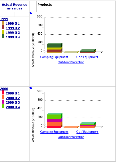
Stacked Bar Display
The stacked bar display shows trends across columns by plotting the relative proportions of parts to the whole and the relationship between the parts. One bar is created for each column. Within a bar, a segment represents the row value.
If the display does not have nested categories, a legend identifies the row or column represented by each color.
Step to Select the Stacked Bar Display
- Click the arrow to the right of the Chart button on the PowerPlay Web toolbar, and then click Stacked Bar.
Steps to Modify the Stacked Bar Display
- Click the arrow to the right of the Chart button on the PowerPlay Web toolbar, and then click Chart Options.
- Click the General tab, and select the options that you want:
- To resize the chart to a percentage of the screen, select the Percentage of Screen check box and, in the Height or Width box, type a number between 10 and 500.
- To specify the shape of the riser, click the Riser Shape drop-down list, and choose either rectangle, beveled, or reverse beveled.
Note: this is not available when you apply depth to the display.
- To specify the size of the bars as a percentage of the available size, use the Bar Size sliding bar, or specify a value in the field.
Note: When the bar size is set to 100%, the bars touch each other.
- To add depth, click the Use Depth check box, and adjust the Depth, and Angle settings.
- To specify the legend type, click either Use HTML Legend, or click Use Embedded Legend and select a location.
- To display bars horizontally, click the Horizontal Chart check box.
- Click the Scale tab to scale the y-axis, show grid lines, or control the number of ticks on the axis. For more information, see Scale the Y-Axis.
- Click the Statistical tab to format statistical lines. For more information, see Show Statistical Lines.
- Click the Palette tab to modify the pattern or color of bars. For more information, see Change the Patterns and Colors in a Display.
- Click the Background tab to apply a color, pattern or gradient to the background of the display. For more information, see Apply a Background Color.
- Click the Labels tab to specify titles. For more information, see Format Labels.
- Click Apply and click OK.
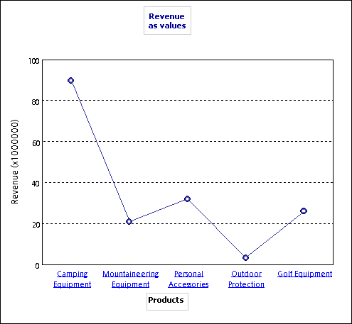
Simple Line Display
Similar to a simple bar display, the simple line display charts the summary row of each column to show absolute contribution. Use to show change over a specific time period, contrast two or more variables, or reveal trends in a clear format. This type of display is useful for discrete data.
Step to Select the Simple Line Display
- Click the arrow to the right of the Chart button on the PowerPlay Web toolbar, and then click Simple Line.
Steps to Modify the Simple Line Display
- Click the arrow to the right of the Chart button on the PowerPlay Web toolbar, and then click Chart Options.
- Click the General tab, and do one or more of the following:
- To resize the chart to a percentage of the screen, select the Percentage of Screen check box and, in the Height or Width box, type a number between 10 and 500.
- To show or hide markers, click the Show Markers check box.
- To show or hide values, click the Show Values above Markers check box.
- Click the Scale tab to scale the y-axis, show grid lines, or control the number of ticks on the axis. For more information, see Scale the Y-Axis.
- Click the Statistical tab to format statistical lines.
- Click the Palette tab to modify the pattern or color of lines.
- Click the Background tab to apply a color, pattern or gradient to the background of the display.
- Click the Labels tab to specify titles.
- Click Apply, and then click OK.
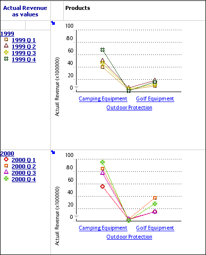
Multiline Display
The multiline display shows trends across columns by plotting the cell values of a crosstab in a line chart. One line is created for each column, with a segment of the line representing each row value. Use to reveals and compare trends and cycles that show relationships between variables, or to show time series analysis and relationships between variables.
If the display does not have nested categories, a legend identifies the row or column represented by each color.
Step to Select the Multiline Display
- Click the arrow to the right of the Chart button on the PowerPlay Web toolbar, and then click Multiline.
Steps to Modify the Multiline Display
- Click the arrow to the right of the Chart button on the PowerPlay Web toolbar, and then click Chart Options.
- Click the General tab, and select the options that you want:
- To resize the chart to a percentage of the screen, select the Percentage of Screen check box and, in the Height or Width box, type a number between 10 and 500.
- To show or hide markers, click the Show Markers check box.
- To show or hide values, click the Show Values above Markers check box.
- To specify the legend type, click either Use HTML Legend, or Use Embedded Legend, and select a location.
- Click the Scale tab to scale the y-axis, show grid lines, or control the number of ticks on the axis.
- Click the Statistical tab to format statistical lines.
- Click the Palette tab to modify the pattern or color of lines.
- Click the Background tab to apply a color, pattern or gradient to the background of the display.
- Click the Labels tab to specify titles.
- Click Apply and click OK.
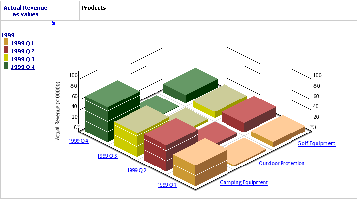
3D Bar Display
The 3 D bar display shows trends across columns by plotting the cell values of a crosstab in a three-dimensional bar. One bar is created for each column, with the top of the bar representing each row value. Use to show relationships between two or more variables to analyze large quantities of data that are difficult to interpret otherwise, or to provide a different perspective on the data.
If the display does not have nested categories, a legend identifies the row or column represented by each color.
Step to Select the 3D Bar Display
- Click the arrow to the right of the Chart button on the PowerPlay Web toolbar, and then click 3D Bar.
Steps to Modify the 3D Bar Display
- Click the arrow to the right of the Chart button on the PowerPlay Web toolbar, and then click Chart Options.
- Click the General tab, and select the options that you want:
- To resize the chart to a percentage of the screen, select the Percentage of Screen check box and, in the Height or Width box, type a number between 10 and 500.
- To specify the size of the bars as a percentage of the available size, use the Bar Size sliding bar, or specify a value in the field.
When the bar size is set to 100%, there is no space between the bars.
- To specify the shape of the riser, click the Riser Shape drop-down list, and choose either rectangle, round, cone, floating cube, or floating sphere.
- To specify the legend type, click either Use HTML Legend, or Use Embedded Legend, and select the location where the legend appears.
- Click the Scale tab to scale the y-axis, show grid lines, or control the number of ticks on the axis.
- Click the Statistical tab to format statistical lines.
- Click the Palette tab to modify the pattern or color of bars.
- Click the Background tab to apply a color, pattern, or gradient to the background of the display.
- Click the Labels tab to specify titles.
- Click Apply and click OK.
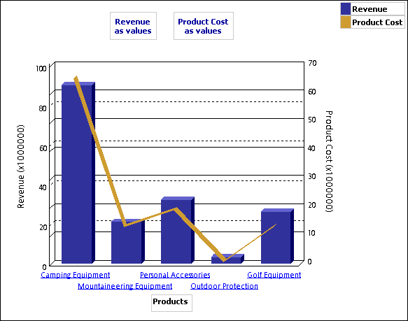
Correlation Display
You use a correlation display to compare two measures in the same cube. The first measure in the cube appears as bars and the second measure appears as lines. By default, PowerPlay Web uses the first two measures in the cube for the display. However, you can change the measures that are compared.
Step to Select the Correlation Display
- Click the arrow to the right of the Chart button on the PowerPlay Web toolbar, and then click Correlation.
Steps to Modify the Correlation Display
- Click the arrow to the right of the Chart button on the PowerPlay Web toolbar, and then click Chart Options.
- Click the General tab, and select the options that you want:
- To resize the chart to a percentage of the screen, select the Percentage of Screen check box and, in the Height or Width box, type a number between 10 and 500.
When the bar size is set to 100%, the bars touch each other.
- To specify the shape of the riser, click the Riser Shape drop-down list, and choose either rectangle, beveled, or reverse beveled.
This is not available when you apply depth to the display.
- To specify the bar size as a percentage of the available size, use the Bar Size sliding bar, or specify a value in the field.
- To show or hide markers, click the Show Markers check box.
- To add depth, click the Use Depth check box, and adjust the Depth and Angle settings.
- To specify the legend type, click either Use HTML Legend, or click Use Embedded Legend and select a location.
- Click Apply and click OK.
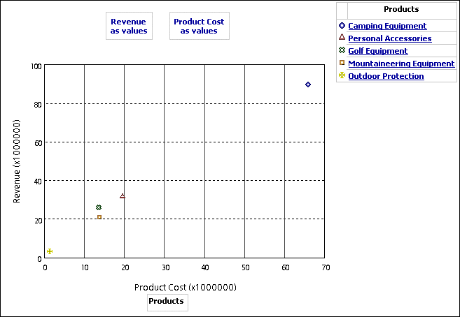
Scatter Display
You can use a scatter display to show the first measure on the Y-axis and the second measure on the X-axis.
Step to Select the Scatter Display
- Click the arrow to the right of the Chart button on the PowerPlay Web toolbar, and then click Scatter.
Steps to Modify the Scatter Display
- Click the arrow to the right of the Chart button on the PowerPlay Web toolbar, and then click Chart Options.
- In the Chart Options dialog box, click the General tab.
- Do one or more of the following:
- To specify the size of the bars as a percentage of the available size, use the Bar Size sliding bar, or specify a value in the field.
When the bar size is set to 100%, the bars touch each other.
- To specify the legend type, click either Use HTML Legend, or click Use Embedded Legend and select a location.
- Click Apply and click OK.